Saturday, 28 May 2016

Cubimorph is Basically a Minecraft Phone (Video)

Cubimorph is Basically a Minecraft Phone (Video)


We like futuristic technology and projects in development more than “coming soon” devices, because they’re closer to reflecting the hopes and dreams of engineers and designers. Such is the case with theCubimorph, a project coming from the Department of Computer Science at the University of Bristol.
Cubimorph modular phone concept (1)
But they weren’t alone, since they worked on this modular phone project with researchers from the Universities of Purdue, Lancaster and Sussex. Cubimorph is an “interactive mobile device”, able tochange shape as the user requires it. At its core is a series of small LEGO-like building blocks, with special and smartly hidden hinges.
Cubimorph modular phone concept (3)
These are touchscreen blocks, combined in a variety of shapes and formats, as shown in the video below. It feels like “Minecraft became a phone”, if you allow me to be poetic. Hinges are used to connect cubes together and these cubes come with touchscreens on each of the six sides. Researchers also managed to somehow integrate motors inside the cubes, letting the device reconfigure and realign itself thanks to those.
Cubimorph can morph into a gaming console, a tablet, phone or whatever you want it to be. The device can be folded, reconfigured and remolded as the user pleases. I look forward to seeing and hearing more about this project and hopefully it won’t go the way of the Nokia Morph.
Cubimorph modular phone concept (5)
Cubimorph modular phone concept (6)
Cubimorph modular phone concept (4)
Cubimorph modular phone concept (2)

Friday, 27 May 2016

TIC TAC TOE

TicTacToe


Stop wasting papers and Play your favourite childhood game Tic Tac Toe on Android now.

DOWNLOAD                                                       


Time to remember your favourite childhood game Tic Tac Toe, you spent hours playing with your friends,classmates.
Stop wasting papers and Play your favourite childhood game Tic Tac Toe on Android now.


Tic Tac Toe supports one player and two players gameplay, So now you can pass your time playing this game against computer or along with your friend.


Details:
The Tic Tac Toe game is a game for two players, called "X" and "O", who take turns marking the spaces in a 3×3 grid. The player who succeeded in placing three respective marks in a horizontal, vertical, or diagonal row wins the game.
The Tic Tac Toe is a great way to pass your free time whether you're standing in a line or spending time with your kids. Stop wasting paper and save trees. Because of the simplicity of Tic Tac Toe, it is often used as a pedagogical tool for teaching the concepts of good sportsmanship and the branch of artificial intelligence.
Start playing Free Tic Tac Toe game on your Android device.


Wednesday, 25 May 2016

Lumia 760

Lumia 760 Render is Too Stylish For Dying Microsoft Mobile


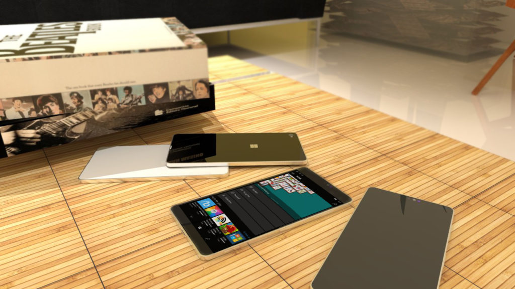
Let’s face it, Windows Mobile/Windows Phone is as good as dead and the Lumia series is a ticking time bomb ready to implode. All that was good about this series is now gone, tarnished by Microsoft’s delayed and uninspired approach. But on a lighter note, some designers still have hope for the series, like Lucas Silva, who created this phone:
Microsoft Lumia 760 render (1)
It’s dubbed Lumia 760 and it’s supposed to be a midranger, an inbetweener much like HTC One A9, but hopefully not as overpriced. The smartphone concept packs a 5 inch display, a Qualcomm Snapdragon 652 CPU and 2 GB of RAM. 16 or 32 GB of storage are here, plus a 13 megapixel Pureview camera and an 8 MP front shooter with Carl Zeiss tech.
Microsoft Lumia 760 render (2)
The Lumia 760 adopts a metal slab design, with an aluminum body, that’s waterproof and also offers an iris scanner. There’s a 3000 mAh battery on board and Windows 10 Mobile Redstone is the OS here. From what I can see we also get a glass back and front, although the designer didn’t mention that. Would you buy this? I would hesitate on account of the OS…
Microsoft Lumia 760 render (3)

Tuesday, 24 May 2016

Nokia 888 Concept

  Nokia 888 Concept


   Design concept

“Form follows you”
A personal mobile communication device which lets you be free and fun. It is light, simple and carefree. You can change its form according to your needs during the day.
Target
It is targeted to the young consumers who are likely to be active and take place in a lot of different activities.

why this target ?
Because they move and change place too much. They do a lot of different things during the day. So that’s what my design offers : to adjust to the moment, the place and the function.
Technologies that are used
It uses liquid battery, speech recognition, flexible touch screen, touch sensitive body cover which lets it understand and adjust to the environment. It has a simple programmable body mechanism so that it changes forms in different situations.

The functionality of design
You dont have to carry it in your pocket or on your wrist. You can carry it anywhere, in anyform. You can roll it, bend it, put on your clothes like a clip. It also makes some form changes that makes it more ergonomical: i.e. when you want to talk on the phone, the body form turns into the form of the good old telephone. You can personalize these forms and record them. So it fits you the best in the way that you have chosen. The functions that it has also create a feeling of electronical pet, as it senses your moves, understand what you want, respond you in the best way. It learns you, to fit you better.Also e-motions lets you send forms to the other 888 users. It could be the shape of a heart or a small dance. This way you can talk without words.
How the user interacts
E-motions… It means electronical motions that 888 has. You can send and receive forms from / to friends. You can send a heart shape to your girlfriend, so her telephone turns into an icon of heart. Or you can send a dancing form to your friends to call them to the party tonight. This is the fun side of the product. If we look from the functionality side, 888 is quite flexible. You can put it into your pocket, roll it and make it smaller, or put on your wrist when you want to make a video call on the go. If you want to talk like a normal telephone, there you have your telephone shape. We go through a lot of places and situations in the daily life, so it seems like one form is not enough.
What is unique ?
You can change the form of the body. Not just the color. And you can do the same by sending an e-motion to your friend.


Monday, 23 May 2016

Samsung Galaxy S8 Concept

Samsung Galaxy S8 Concept Rendered by Omer Pala, Goes Full Metal


Samsung Galaxy S8 is beginning to manifest itself online, as speculations and rumors, but not as leaks for now. Concept designers have let their imagination run wild on this topic once or twice already, but today we have a more detailed gallery of renders, shown below.
Samsung Galaxy S8 concept Omer Pala (10)
Created by Omer Pala aka Wardson, the Samsung Galaxy S8 features a full glass body (including sides), covered with metal. I don’t know how exactly that would work, since it would make more sense to cover metal with glass not the other way around. Anyway, the buttons are supposed to be shaped as “hexagons”, for some reason and the device has a curved back.
Samsung Galaxy S8 concept Omer Pala (6)
This time the Galaxy S8 gets a shutter button and a big speaker for improved sound performance. It also users SonicMaster Audio, borrowed from ASUS if I’m not mistaking. The heart rate monitor has been pulled to the right side of the back curve, in order to make the usage easier. There’s still IP67 certification for waterproofing and we’re back to the megapixel war with a 16 MP back shooter.
There are a few aspects that don’t click for mere, such as the huge port area at the bottom or the rough finishing of the device. Interestingly one of the slides sent to us by the designer seems to detail modularity, so maybe we’d like more details on that.

Friday, 20 May 2016

NISSAN IDS CONCEPT THE FUTURE OF AUTONOMOUS ELECTRIC DRIVING

NISSAN IDS CONCEPT 

By combining cutting-edge artificial intelligence and leading EV technology, the IDS Concept is zeroing in on two of Nissan's aspirational goals: zero emissions and zero traffic fatalities. But this concept isn’t just built to take you safely and efficiently from point A to point B. Even in Piloted Drive mode, when the vehicle is in control, it mimics the driver’s own style and preferences—promising a gratifying, fun drive. - 


DESIGNED TO GO THE DISTANCE
Fitted with a high-capacity 60 kWh battery, the Nissan IDS Concept's carbon-fiber hatchback body is lightweight and aerodynamic, for increased driving range. Its low stance minimizes drag and its ultra-thin, low rolling resistance tires — positioned close to the corners to maximize interior space—improve air flow.


A TRANSFORMATIVE EXPERIENCE

Choose Piloted Drive and watch the steering wheel disappear inside the instrument panel. All four seats rotate slightly inward—like the conversation corner of a cozy living room—and a large panel displaying route updates, appointments and more takes center stage. Choose Manual Drive and the interior is transformed to put the driver in control. Seats face forward, the steering wheel reappears, and the interior lighting switches to blue to stimulate concentration.


STREET HARMONY
The Nissan IDS Concept communicates with those outside the car as well as with its interior passengers. An LED line on the side body shines white to indicate its awareness of pedestrians or cyclists. And with clever electronic displays—like an "After You" flashing message—the concept also clearly signals its intentions.


Thursday, 19 May 2016

Bugatti Chronos Smartphone

Bugatti Chronos Smartphone Created by Mladen Milic, With a Splash of LG G and ASUS Phone


Who hasn’t heard about Bugatti? The French maker of one of the world’s most desired cars expanded to making other products, like Ferrari did, including clothes and accessories, but never handsets. Well, at least we have inspired designers to take on this task. Mladen Milic is one of them and he envisioned the following Bugatti Chronos smartphone concept.

Bugatti smartphone concept Mladen Milic  (1)

The result feels like a combo of the ASUS gaming phone created by the same designer and maybe the LG G4 and G3. The back side of the phone has a variety of textures, including wood, metal and the works, reminding me of Motorola’s custom backs. This model also has a bit of OnePlus vibe, but I can’t exactly pinpoint where it comes from.

Bugatti smartphone concept Mladen Milic  (2)

Anyway, know that it brings a Quad HD 2.5D front panel with a 5.5 inch diagonal and a main 23 megapixel camera plus a 16 megapixel selfie shooter. There’s 64 GB of storage, 4 GB of RAM and a 4020 mAh battery on board. This is a waterproof phone, with a fingerprint scanner, wireless charging and USB Type C port. The back side, especially the portion below the camera is shaped like the front side of a Bugatti car.
That’s one fancy and probably expensive (if ever real) phone!

Bugatti smartphone concept Mladen Milic  (3)
Bugatti smartphone concept Mladen Milic  (4)
Bugatti smartphone concept Mladen Milic  (5)
Bugatti smartphone concept Mladen Milic  (6)
Bugatti smartphone concept Mladen Milic  (7)

HTC Zeta and HTC Abori

HTC Zeta and HTC Abori Get Rendered With Old School Designs


I knew the HTC Zeta concept was familiar! Originally spotted in 2011, this model adopts a design that nowadays would be considered unusual. It’s accompanied in the image below the HTC Abori, created by the same designer, Clement Servonnat.

HTC Zeta HTC Abori concept

The Zeta has a curved edge for a more ergonomic hold, while the Abori packs a kickstand for improved video watching, like the HTC HD 7 had. The design of the HTC Zeta reminds me of an All in One PC, particularly the top side, while the whole camera area is a bit overkill. The bottom portion feels like a continuation of the AIO idea, while the front is a bit unrealistic, unless you’re Sharp Aquos.
HTC Abori has an interesting camera with dual LED flash and its back angularity has a racing car feel, that the Acer Predator or ASUS ZenFone 2 Deluxe Special Edition provided. Interesting placement of the speaker by the way. Also, when seen from the side at least one of these models feels like a Nokia N8…

iPhone 7 Concept Made by DBS is Seriously Good

iPhone 7 Concept Made by DBS is Seriously Good, Needs to Happen (Video)


Here we go again, with the iPhone 7 concepts that are mouth watering and so good, that Apple will have a very hard time churning out something half as decent as them. This time the DBS team created the iPhone 7 render below, with video included.


iPhone 7 concept may 2016 DBS (1)


We’re dealing with a beast of a phone with 3D Touch in the mix, 4K display and iOS 10. Storage goes up to 512 GB and we get a crazy 6 GB of RAM. A deca core CPU and 5000 mAh battery take the specs to the stratosphere. The device has a dual back camera and moves its antenna lines to the top. This model shows notifications on the sides and has virtual volume buttons integrated in side screens.

iPhone 7 concept may 2016 DBS (3)

The display is clearly an edge to edge one and I don’t get why the Home button was kept, seeing how LG cracked the inclusion of the fingerprint scanner within this button. 4K video recording at 120 FPS is promised here, plus a 16 megapixel front camera and a 24 megapixel dual back camera. It appears that the dual side screens can be locked to prevent accidental touches.
The thing I like the most here is the back of the phone, that looks pretty close to what Apple is rumored to be preparing. The general format feels more like a Vivo or Meizu and Apple usually opts for more curves…

iPhone 7 concept may 2016 DBS (4)
iPhone 7 concept may 2016 DBS (2)

Apple Glass Concept

Apple Glass Concept Shows Us All the AR Goodness We Need These days  smart glasses  are back in full force, courtesy of so...